
The Cake Wrecks website showcases poorly made cakes and allows users to view and submit photos. After multiple questionnaires and a series of heuristic evaluations, the site was determined to have usability issues and visual hierarchy disfunction.
The Cake Wrecks website was dated, cluttered, and unorganized. Per user reviews, it was difficult to navigate and find the necessary components on the Home and About pages.


As a team, we created a more cohesive website by altering the Home and About pages, based off the results of heuristic evaluations, user research, and usability testing.


As a user, I enjoyed looking at the various photos of cakes and exploring a webpage that is used by numerous people. However, I believe that in order to enjoy the experience, it must be easy to navigate for the average user and designed in a way that enhances user experience. As a designer, I am aware my designing is objective and not personalized. User issues cannot be assumed, therefore our team completed heuristic evaluations to determine overall usability. After finding severe issues on the site, we created and conducted a survey and two questionnaires to determine the demographics of site visitors and developed user personas to guide our study.


The survey allowed us to gather data about user interactions and experiences within the website. It was influential in identifying and creating personas for multiple types of users. This research format was chosen to get the most specific demographic representation of our users. I devised a detailed questionnaire, collaborated with the group to build tasks and scenarios related to usability issues, and created an observation sheet to document the paths taken by our users to complete those tasks. Users identified issues such as: no search suggestions or filters provided, lack of visibility of the system’s status, no user guide or help, and overall dated design of the pages and aesthetics. We formed a hypothesis that people need convenience and excitement when exploring this website.
Evoke a sense of amusement and embody the webpage’s characteristics throughout the visual design system
Emphasize the main photos and easily allow others to contribute their own in a harmonious manner
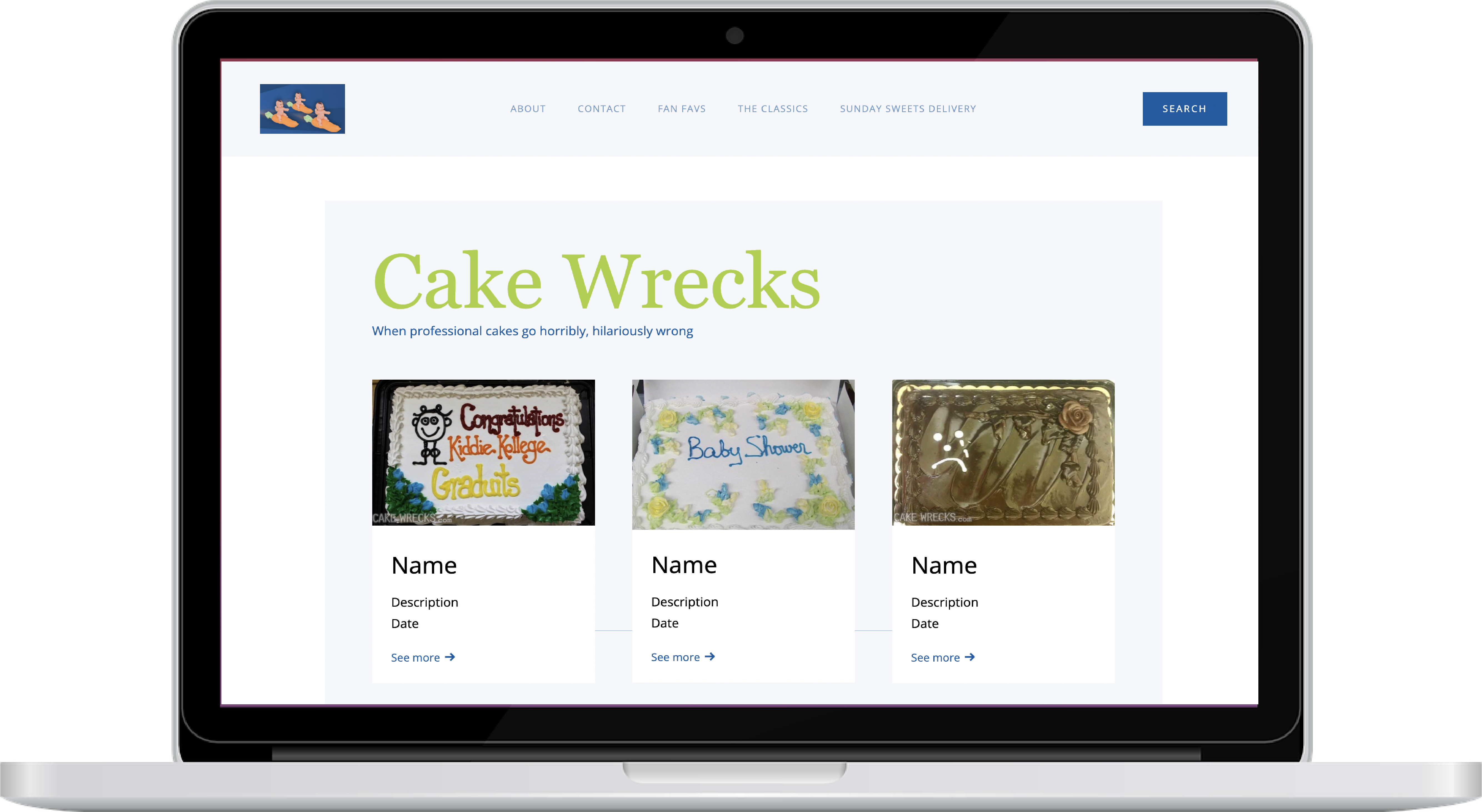
Having understood the design goals, we began brainstorming ideas to achieve the mentioned goals. Based on the user interviews and collaboration with team members, it was determined the home page is where the majority of the redesign needs to occur. The website is made up of submissions, thus the contact/submission page needs to be inviting and user friendly, so the rest of the efforts are placed here.
I created several mockups of potential layouts that would best solve the issues at hand. To help users quickly identify the Main and About pages, the page needs to be cleared of clutter.
First, we needed to determine how to define which pictures and text belong in each area? With this idea in mind, I drew out two low fidelity wireframes and devised a list of pros and cons for each. This caused me to think: what are the primary elements that entice users to keep using the site and navigating from picture to picture?


Pro: Offers variety of photos and information
Con: Can be cluttered and lack true organization
Pro: It is clear that users can scroll and select photos
Con: On computer, a scroll feed is not as friendly as if on a mobile device
I created mockups of the wire frames and discussed with team members. The team noted that the formats I had originally made left out some of the photos within the photo groups. The photo groups are a group of photos that share either submission, style, or date. Based off the feedback and the preferred ways to group photos, I developed an alternative. I decided that organizing each photo group by date would make them more fluid and much more categorical.

Pro: Includes photos in same submissions and same dates in order

Typography used in these mockups are unique and appealing fonts. Sans-serif Open Sans font is used in the text and body portions and the main headings are in Georgia font. The typography chosen increases legibility and provides a friendly appearance.

The color palette is quite minimal but was used in an excessive matter with lacking whitespace between elements. The original colors of blue and green where still used but placed as accents to keep distractions to a minimum.

Because of the nature of this project, the final design lacked real user-structured feedback at the end to determine if the new design is in fact more useful. If this were a project where we worked with developers, we would have learned more about the limitations on the ideas that we had. The importance of real user data taken from the site would have helped in establishing unseen user patterns and needs.
There were several questions that I believe would’ve been influential in understanding the full extent of the website and problems at hand. These include:
While brainstorming with my teammates, I was challenged to incorporate user needs and teammate ideas to create a fluid and functional experience. Working on this redesign, allowed us to appreciate the use of statistical data collected on sites and the importance in determining user behavior based on the known data. This redesign allowed me to deep-dive into how new features can affect and disrupt existing features and the mental models behind them.
Made with love and webflow